Join Dataflo @ SaaS Insider's India 2022 on May 26 - 27
Register Now


We all know that having a good BI solution in your business is essential, but finding one can take time and effort. Especially for a growing business, some of these no-code solutions can be quite expensive.
With all the buzz about data vizualization tools, you might have wondered if you'll ever find a tool perfect for you, your team, and your business.
Geckoboard is one such great solution for businesses seeking a tool that is feature rich and affordable at the same time. It is a simple and beautiful way to track the KPIs that matter most to you and your team.
Although Geckoboard has many useful features and good customer service, there may be other better fits for some businesses. So, different strokes for different folks might be the need of the hour, and there are loads of Geckoboard alternatives out there that can cater to your needs.
For those on the fence about using Geckoboard, we have compiled a list of 7 alternatives that might help ease the confusion.
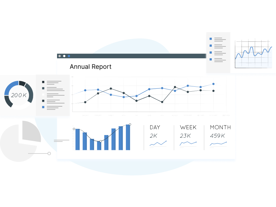
Geckoboard's dashboard builder enables you to create beautiful and insightful dashboards that let you monitor the performance of your business across any number of metrics. You can also create customized widgets that show specific data points so that you can keep track of what matters most to your company without having to look at multiple reports.
When you're ready for even more customization and personalization options, Geckoboard gives you access to over 100 different chart types and dozens of different map options for visualizing geographic information.
Geckoboard’s ‘Send to TV’ feature allows you to pair your account with an external screen (like a large monitor or television) so that you can view the dashboards of your choice.

Organize your widgets on the dashboard- Users can see how different metrics are related by organizing them into logical groups.
Status-based alerts- Adding status indicators to your widgets will flag numbers when they reach a red or green warning state.
Adding goals to widgets- Applying a goal to your widgets can help you track your progress and alert you when you reach your target.
Integrations of Geckoboard- Geckoboard can be integrated with AWeber, HubSpot, Salesforce, Campaign Monitor, Google Analytics and Zapier, etc.
Here is a list of the pricing options offered by Geckoboard.
You can also get a 14-day free trial that includes all feature.
Are you looking to gain management and customer insight into your SaaS business? KPI dashboards are a great way to do it. Dataflo is a data acquisition and dashboard builder that helps with creating KPI dashboards in minutes.
You can easily see how live KPI dashboards give you visual feedback on your key metrics and your SaaS business's performance in real-time using Dataflo.
Reason#1- It’s relatively expensive- Geckoboard is more expensive than some other dashboard tools available. (($49/month for 1 dashboard, or $159/month for 5) which is pretty high if we compare it with other alternatives to Geckoboard.
Reason# 2- Compatibility with other tools and services- Geckoboard has integrations with Google Analytics and Slack, among others; if you're looking for something that integrates with more services or has more integration options, you may check out other options.
Reason# 3- Lacks advanced customization options- Geckoboard offers basic customization options such as custom dashboards, but if you need more advanced customization capabilities such as creating your own charts or adding information from other sources into the dashboard, then Geckoboard is not for you.
Reason# 4- Metric comparison is missing- Geckoboard focuses on one main metric (like revenue) and doesn't provide any additional context about how those numbers are doing compared to other metrics (like profits).
Dataflo is an analytics solution for SaaS businesses that vizualizes your marketing data across multiple sources. It helps users understand and identify the right metrics relevant to their business and allows them to compare them over time easily.
It helps you achieve your goals by providing a clear overview of your marketing efforts. The user-friendly interface of Dataflo sets it apart from its competitors.
Dataflo streamlines your data collection process and delivers it to you in a way tailored to how you want to see it. You can create dashboards in minutes and track metrics that matter most to you.
With Dataflo, you can receive instant alerts, daily metric reports, and collaboration notifications within Slack. There are many reasons why this tool is so helpful for marketers.
Read More: Are you looking to gain management and customer insight into your SaaS business? KPI dashboards are a great way to do it. Dataflo is a data acquisition and dashboard builder that helps with creating KPI dashboards in minutes.
You can easily see how live KPI dashboards give you visual feedback on your key metrics and your SaaS business's performance in real-time using Dataflo.


Dataflo offers the following pricing plans:
Starter: Free includes up to 3 users + 3 datasources
Growth: $99 per/month with unlimited users + 10 datasources
Premium: $199 per/month with unlimited users + unlimited datasources
We have a 14-day free trial with all the features.
Collaboration is the key to successful teamwork. Whether you're a boss or a member of a team, collaboration is vital. Check out Dataflo for better collaboration options like commenting on metrics, sharing metrics on Slack, and receiving notifications about metrics.
Databox is another good analytics tool for creating charts, graphs, and maps. It was built to make it easy for anyone to create beautiful vizualizations without writing code.
The DataBox lets you start with a blank canvas or use one of their templates to get started quickly. After that, you can use the drag-and-drop interface to add data, change colors and fonts, add effects like gradients and shadows, and more.
The user interface is simple and intuitive, making it easy to create powerful graphics in just a few clicks.

Calculate your key metrics- Access data from any source and calculate metrics, conversion rates, ROI, and more, without any coding.
Track your goals- You can define, assign, and track progress toward SMART Goals all on one screen.
Daily/ Weekly Scorecards- Get daily, weekly, or monthly updates on your most important KPIs via email, mobile push notification, or Slack.
Alerts and Insights- Be notified when your performance is off and don't wait until quarter end to find out. You can see your team’s performance and get insights on how to improve the performance.
Integrations- Databox can be integrated with Slack, Mailchimp, Hubspot Marketing hub, Google sheets, PayPal, Google Analytics 360, Instagram, and many more.
Databox offers a 15-day free trial of any paid plan.
Free: $0, includes up to 3 datasources, 3 Dashboards with 5 users, and Daily Data Refresh
Starter: $72/month
Professional: $135/month
Performer: $231/ month
Klipfolio is a data vizualization tool that allows you to create professional-looking charts and graphs. It's especially useful for businesses looking to gain insight from their data, or individuals who want to easily share charts with others.
It's easy to use and can be an effective way to present data in a visual way. It helps show trends and performance over time and helps in making data-driven decisions. Klipfolio adapts to different types of data sets. It also offers a wide range of templates and options for formatting your final product.

Interactive data vizualization- Vizualize your data in real-time, so you can make quick decisions based on updated information.
Customizable dashboards- Design your dashboards with a variety of charts, graphs, and other data vizualizations to best suit your needs.
Live updating and sharing- Share your dashboards with the world and let everyone see how great they are!
Integrations- Klipfolio’s integrations include Google Analytics, Salesforce, Facebook Ads, YouTube Ads, Twitter Ads, and more.
Klipfolio offers the following pricing models-
It also offers custom plans for enterprises starting at $499/month.
Looker Studio or Google Data Studio is a data vizualization tool that allows you to create and share interactive dashboards, reports, and presentations. It allows you to collect data from multiple sources and display it in a variety of charts and graphs.
You can also create dynamic reports that update automatically when you add new data, which makes it easy for you to keep your team on top of their metrics without having to manually create new reports every time you get new information.
In case you're looking for a free tool to generate customizable and insightful reports, Looker Studio can be a viable option.
Related: Marketing dashboards are an important tool to help you refine your efforts. If you’re looking for a visual display of everything that's going on with your marketing campaigns so you can quickly spot any trends and issues, then you should check out our blog on how to create a marketing dashboard using Looker Studio.

Modern and Interactive Data Vizualizations- Once you have the data, you can create modern-looking charts and tables with multiple dimensions.
Schedule Email Reports- You can schedule reports to be emailed to recipients at specific times.
Create Easy-to-Read Reports- The self-service and standard reports interfaces are pretty intuitive and simple to navigate.
Share and Collaborate- You can set up dashboards so they can be easily accessed by other members of your team.
Integrations- Looker Studio offers integrations with Google Analytics, Google Ads, BigQuery, Ad Manager, Attribution 360, Campaign Manager, Google Sheets, and more.
Looker Studio is a free platform that's part of the Google Cloud offering.
Hockeystack is a data vizualization tool that allows users to create graphs and charts from their data, which can be exported and shared with others. The tool has a number of features that make it easy to use, including drag-and-drop functionality, automatic scaling, and the ability to add or remove chart elements.
The importance of Hockeystack lies in its ability to make data more accessible for people who aren't as familiar with spreadsheet software. It's also useful for businesses because it allows them to present data in an easily understandable way.
Custom Reporting- Allow any member of your team to create & access the reports they need with an easy UI & no code, with templates or from scratch.
The flexibility of use- You can choose from dozens of different types of charts and graphs at any time while working on your project.
Great collaboration features- Hockeystack's shared editor feature lets everyone get access to all so this will allow everyone involved in creating a report. It also allows you to connect with your team using Slack or email.
Customer Surveys- Conduct surveys at every step of the customer journey, use responses in your reports and find out what people really think.
Integrations- Hockeystack can integrate with Hubspot CRM, Stripe, Mailchimp, Paddle, Pipedrive, Chargebee, and more.
HockeyStack offers the following two paid plans:
All the plans have a 14-day trial along with a 30-day money-back guarantee.
DashThis is a popular tool that helps you make sense of your data by vizualizing and analyzing your data. It allows you to create visualizations and share them with others, enabling you to collaborate on projects, share your findings with clients or coworkers, and make better decisions in your business.
You can also create your own custom widgets, add logos, headers, and notes, and customize your dashboard to fit the needs of your business.
The software is a great choice for users who need to create vizualizations quickly and easily, without having to write any code.

Customized reports: Create reports that are specific to your needs by filtering out certain fields or selecting a specific type of vizualization (such as a pie chart or line graph)
Customizable Dashboards- The tool lets you to change themes and customize your dashboard (you can also choose between light or dark mode)
Real-time updates- The tool keeps a tab on metrics with consistent and frequent updates in real-time.
Integrations- DashThis can be integrated with Google Analytics 360, Mailchimp, Instagram, LinkedIn, Semrush, Google Ads, and Twitter.
DashThis offers the following pricing models:
It offers a 15 days free trail also.
Whatagraph is a data vizualization tool that lets you create beautiful, interactive dashboards with just a few clicks. It's fast, easy, and super customizable.
You can use Whatagraph to quickly create vizualizations that show your data in a way that's easy for anyone to understand. You can add filters and search functions, so users can easily find what they're looking for without getting lost in the details or having to scroll through pages of information on their own.
Whatagraph also makes it easy to collaborate on projects with other people—you can share your dashboards with others and get feedback on them from all over the world!

ROI Tracking- Marketers can measure return on investment (ROI) by analyzing campaign effectiveness against the costs.
White Label- Whatagraph offers a white labeling service that allows agencies or resellers to customize the branding of the platform.
Customer insights- The tool can compile and analyzes data related to customer journeys, preferences, and histories.
Campaign Activity- Whatagraph helps evaluate current and historical marketing campaigns to inform future efforts.
Integrations- Whatagraph offers integrations with Google Analytics, Campaign Monitor, AdRoll and Mailchimp, and more.
The following pricing plans are available for Whatagraph:
There is a 30-day money-back guarantee for all the available plans.
As always, the best solution often begins with a simple Google search! The choices are plentiful when looking for a data vizualization tool. No two tools are completely identical, but you'll find that some options are better suited to your unique needs than others. The same is true for Geckoboard alternatives.
Of course, there are several other factors to consider besides price and features, including customer support and ease of use. With a little bit of research, and perhaps a trial period with the tool of your choice, you'll find that it's easy to find the right data vizualization solution for your needs.
If you're looking for a new way to understand your SaaS business and make smarter, faster business decisions—Dataflo might be worth taking for a spin. It's got a ton of features that can help you track your business performance. Book a demo today.


Ira is a writer and blogs about her love of words. She has been responsible for creating powerful and effective content that attracts and retains customers. A blend of her humble writing experience and an endeavour to inspire people with her words is on her table now. She is an avid reader and a music lover too. She loves to devote time each day to yoga and meditation in addition to going for walks.